Introduction
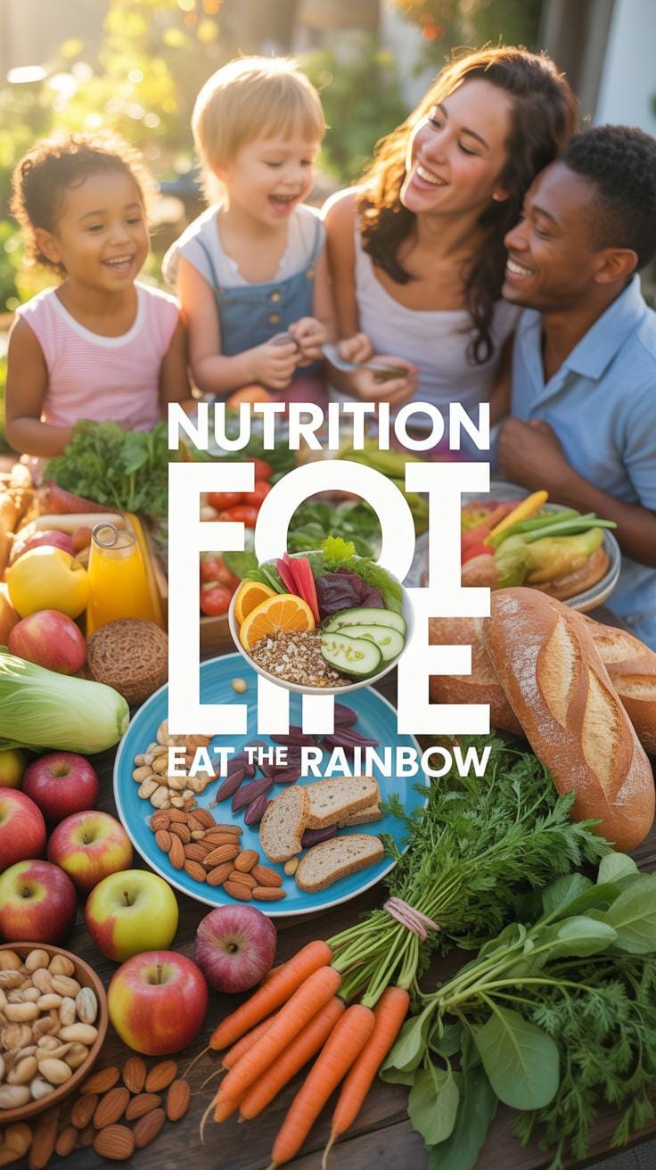
Nutrition posters are important tools for communicating essential dietary information in an engaging and accessible way. Creating effective nutrition posters requires understanding which elements attract attention and convey clear messages. Nutrition Poster Ideas Creative Trends For Food And Nutrition Posters focus on how visuals, concise text, and layout work together to educate and motivate audiences.
This article reviews key elements in nutrition posters, explores creative design trends, and offers practical guidance on making posters that catch the eye and promote healthy eating behaviors. Whether you’re designing for schools, clinics, or community centers, these insights can help you craft posters that work well and spread valuable information.
Understanding Nutrition Poster Purposes
Nutrition posters aim to do more than just decorate a wall. Their core goal is to influence behavior subtly yet effectively. By presenting nutrition facts clearly and simply, they can encourage healthier choices without overwhelming you with information. Sometimes, the message is motivational—designed to inspire rather than instruct.
These posters spread awareness by cutting through the noise of conflicting diet advice we often see. They rely on straightforward visuals and concise text to help people grasp important health facts quickly. Think of them as a gentle nudge toward better eating habits, emphasizing what you can do rather than what you shouldn’t.
They also play a part in supporting ongoing health education efforts. You might find them reinforcing advice from healthcare providers or community programs, blending factual content with everyday relevance. The challenge lies in balancing accuracy with accessibility, so the message really sticks.
How Posters Support Health Education
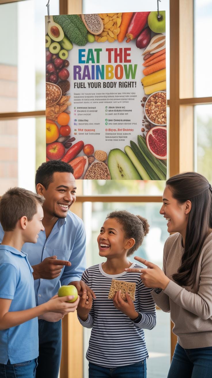
Nutrition posters find a place in both formal classrooms and informal settings. In schools, they back up lessons taught by teachers, providing visual reminders that reinforce key points about healthy eating. In clinics or community centers, they supplement the guidance given by healthcare staff, offering take-home messages that linger beyond the appointment.
They’re helpful in community programs too, where they can spark conversations or even serve as talking points for group discussions on nutrition. The simplicity and clarity of posters make them flexible tools, easy to integrate no matter the audience or setting.
Who Benefits From Nutrition Posters
Nutrition posters aren’t one-size-fits-all, though. Students benefit from posters designed with engaging graphics and relatable language. Patients might need more detailed, condition-specific information presented gently to avoid confusion or anxiety. As for the general public, the information must be broadly relevant and concise, often focusing on everyday choices.
What makes information stick varies: students often appreciate visuals and quick facts, patients want clarity and reassurance, and the general public needs practical tips they can apply without much effort. Striking this balance isn’t easy, but when done right, these posters become powerful tools for spreading knowledge and promoting healthier lives.
Key Elements Of Nutrition Posters
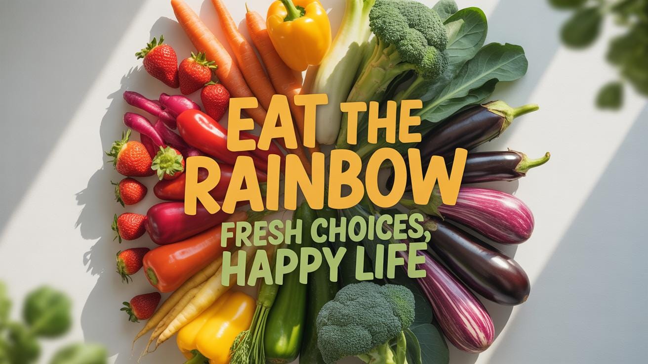
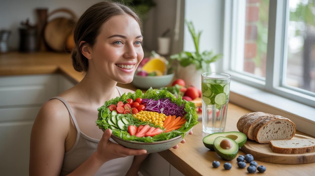
When creating nutrition posters, certain elements grab and keep your attention more effectively. For starters, images matter a lot. Bright, clear photos or illustrations of fresh fruits, vegetables, or balanced meals can immediately communicate healthy choices without needing too many words. People often respond better to visuals than text, so make good use of them.
Text should be simple and straightforward. Use language anyone can understand; the goal is to inform, not confuse. Clear titles help guide viewers—they quickly tell you what the poster is about before you even read the details.
Then, there’s color. Choose colors that feel natural and inviting—think greens and warm tones. These can evoke feelings of health and freshness, but be careful not to overdo it. Too many colors can distract rather than help.
Layout influences how easily someone absorbs information. Organize content neatly with enough white space. Break information into bite-sized chunks with bullet points or short phrases. A crowded poster risks being skipped.
For example, placing a colorful image of a balanced plate at the top, followed by a bold title, and then clear bullet points below, keeps things accessible. Fonts should be easy to read from a distance—nothing fancy or overly thin.
Each element—images, text, color, and layout—plays a distinct role. Mixed thoughtfully, they can make nutrition posters that stick in your mind long after you see them. You might notice others skipping posters that look cluttered or text-heavy, and you’d want to avoid that. Ever wondered why some posters just feel right? It’s this harmony of elements working together.
Creative Trends In Poster Design

Nutrition posters today borrow heavily from modern design trends that capture attention quickly. You might notice many employ minimalist styles—clean layouts with ample white space and focus on key nutrients or food groups. This approach avoids overwhelming viewers, helping them concentrate on the essentials. But then, there are also posters rich in infographics, where colorful charts, graphs, or step-by-step guides break down complex information like calorie counts or vitamin benefits. These visually appealing elements can make a big difference in how fast and clear the message comes across.
Illustrations, too, are gaining popularity. Hand-drawn fruits, vegetables, or playful characters make the poster feel friendlier and relatable. It’s like the difference between a cold fact sheet and a friendly conversation. If you ask me, mixing styles often works best. Minimalist posters can draw you in, while infographics and illustrations keep you engaged longer. So, it’s about striking a balance that fits your audience and message without clutter or confusion.
Use Of Infographics And Icons
Infographics and icons play a surprisingly big role in nutrition posters. By turning numbers and facts into visuals, posters become much easier to understand at a glance. For example, instead of listing vitamins A, C, and E with elaborate definitions, icons of fruits containing them can quickly communicate health benefits. This visual shorthand reduces cognitive load—meaning your brain doesn’t have to work as hard to grasp the message.
People are often pressed for time, so a well-designed infographic can deliver essential info in seconds. Think about traffic signs or app symbols; they’re effective because they simplify stuff. Nutrition posters use the same principle, making data engaging and memorable. But a tiny caution: not all icons are intuitive to everyone. Testing your design against your audience is usually a good idea to avoid confusion.
Minimalist Versus Detailed Layouts
Choosing between minimalist and detailed posters depends a lot on where and why the poster will be used. Minimalist designs shine in busy spaces like cafeterias or gyms where people glance briefly and need quick takeaways. They highlight a few key points, like the “5 a day” rule or hydration reminders, without extra fluff.
On the other hand, detailed layouts suit educational settings, clinics, or workshops where viewers stop longer and want a comprehensive understanding. These posters pack text, charts, and images to cover nutrients, meal plans, and myths. They might seem overwhelming in casual spaces, though, and risk losing readers if too dense.
So, consider your audience’s attention span, setting, and goal. Sometimes, combining minimalism’s clarity with pockets of detailed info in infographics offers a practical middle ground. It’s a bit like offering an appetizer with options to dive deeper if curiosity strikes. You’ll want to experiment to find the right mix for your needs.
Steps To Create Your Nutrition Poster
Planning Content And Messaging
Start with a clear idea of what you want to say. What is the main message you want your audience to leave with? Keep it simple; nutrition can get complicated quickly. Focus on one or two key points that suit your audience’s needs. For example, if your audience is busy parents, maybe emphasize quick healthy meals rather than detailed dietary science. Think about what your viewers already know and what they should learn. Jot down relevant facts, but make sure they are credible and not overwhelming.
It’s helpful to write a rough list of the nutritional content you’ll include. Will you highlight food groups, vitamins, or balanced meals? Tailor this content to fit the picture your poster wants to paint about healthy eating. Sometimes less is more; you don’t need to cram every detail onto your poster. Narrow your focus so the message lands clearly and memorably.
Choosing Visuals And Fonts
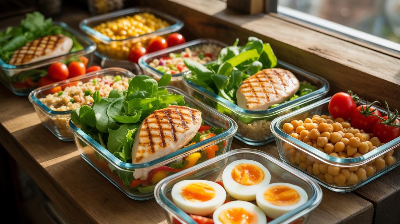
Next, choose images and fonts that support your message. Pick visuals that grab attention but won’t distract from the information. Real photos of fresh fruits and vegetables often work well, but illustrated icons or charts can also do the trick if that fits your style. Be mindful that your chosen visuals connect with your audience culturally and age-wise.
Fonts are more than decoration; they steer how easy it is to read your poster. Use clean, simple fonts for body text to ensure clarity. Maybe add a more distinctive font for the title or headings—just don’t overdo it. Think about size, too: your message needs to be readable from a distance, so don’t use tiny fonts. Emphasize key points by varying font weight or color, but keep the overall look balanced. Do you want the poster to feel friendly, professional, or fun? Your fonts and images should reflect that tone.
As a final tip, step back frequently to see your poster as a whole. Does it communicate your main message quickly? If not, tweak the content, visuals, or fonts until it does. Remember, proofreading matters here — typos or confusing layouts can undermine your credibility, even if your facts are solid.
Benefits Of Using Digital Posters

Digital nutrition posters offer more flexibility than their traditional counterparts, making them quite practical for many settings. Think about the ease of distribution—you can share these posters immediately through emails, social media channels like Facebook or Instagram, or embed them directly on websites. This kind of access just wasn’t possible before.
Updating information is another major advantage. Imagine needing to correct or add new calorie counts or nutritional facts—you don’t have to print a whole new batch. Instead, you just edit the digital file and re-upload it. It’s surprisingly convenient, and this quick turnaround means your content can stay current without extra cost.
One feature that makes digital posters stand out is their interactivity. Unlike static paper versions, digital formats can include clickable links that redirect to recipes or more detailed articles. Animated graphics or infographics can illustrate portion sizes visually, making the message clearer. Even quizzes embedded within the poster encourage viewers to engage actively, reinforcing learning in ways that a plain poster can’t achieve.
You might find these interactive posters on platforms like Canva, Adobe Spark, or even within custom health apps. Each allows a different range of design, animation, and sharing functions, so your choice depends on how complex your poster needs to be. Still, many people overlook digital posters simply because the idea feels new or unfamiliar, even though they offer obvious benefits once you give them a try.
Common Design Mistakes To Avoid

When you look at nutrition posters, some mistakes pop out right away. Cluttered layouts are a big problem. It’s like cramming too many things into a small space—nothing stands out, and your eyes just bounce around without settling. Then there’s too much text. Posters stuffed with paragraphs or complicated charts lose people quickly. If the message isn’t clear from a quick glance, it’s often ignored. And vague or mixed messages don’t help either—you want viewers to grasp the point immediately.
Fixing these issues means prioritizing what’s really important and trimming the excess. Focus on one or two main messages. Use simple, direct language. Break information into short chunks or bullet points. Space things out so each element has breathing room. And test your poster by seeing if someone unfamiliar understands it in a few seconds.
Avoid Overloading With Information
There’s a temptation to pile on facts and figures to prove a point, but this backfires. Too much text or data overloads the viewer’s brain. People skim or skip when there’s too much to take in. It’s like reading a mini-essay on a wall—who has the time? Instead, prioritize the core ideas. Use bold headlines and bite-sized facts. Visuals can replace words to explain concepts quickly. And don’t hesitate to split complex data over several posters or handouts if needed.
Ensuring Visual Clarity And Balance
Color choice matters more than you might think. Poor contrasts make reading hard—don’t put light yellow text on a pale green background, for example. Small fonts strain the eyes and scare viewers away. Crowded images or overlapping text create chaos and confusion. Aim for clear, legible fonts sized for easy reading from a distance.
Balance is key. Try to spread out text and images rather than bunching everything together. White space isn’t wasted—it guides the reader’s focus and makes the poster more approachable. Play around with layout until it feels calm and organized. Your viewers will thank you, even if they don’t say it directly.
Nutrition Poster Examples And Case Studies
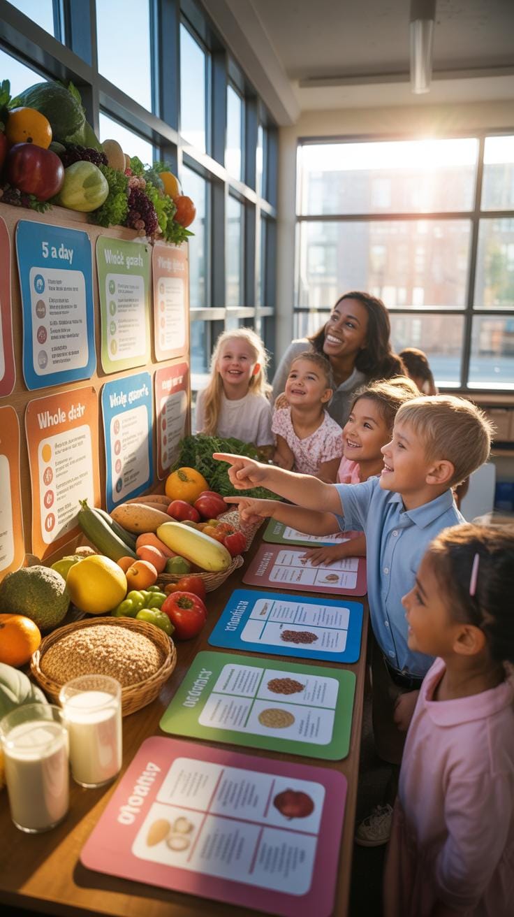
Successful Posters In Schools
Schools offer a unique setting to promote nutrition awareness through posters. One memorable example was a poster campaign in a middle school that used vibrant colors and simple visuals to explain the food pyramid. Students responded well because the illustrations were relatable—showing foods they actually eat—and the messages were short but catchy. The design avoided clutter, focusing each poster on one key idea like choosing fruits or understanding portion sizes.
What worked best was the balance between educational facts and engaging imagery. Posters placed near cafeterias and hallways caught attention repeatedly throughout the day. This repetition seemed to help reinforce healthier choices. It’s interesting how even subtle changes in wording, like replacing “avoid junk food” with “choose colorful snacks,” made students less defensive and more curious.
Community And Healthcare Posters
Public health agencies often rely on posters in clinics or community centers to inform about nutritious habits and disease prevention. One case study involved a series of posters targeting diabetic patients. These used clear charts and real-life tips, for instance, how to swap sugary drinks for water. Patients reportedly understood their condition better and felt motivated to modify their diets.
The effectiveness here came from focusing on achievable actions rather than overwhelming with statistics. The posters’ language was straightforward, with some space for notes or questions, encouraging interaction. Placing posters where waiting times are longer gave people a chance to absorb the info, which might explain improvements in patient engagement documented in follow-up surveys.
Both school and healthcare posters prove that the design and message must be tailored to the audience. But I wonder, how much does the local culture shape what really clicks with viewers? Perhaps that’s something to experiment with in your own posters—testing what resonates and what feels forced.
Tools For Making Nutrition Posters
When it comes to creating nutrition posters, the tools you choose can make a significant difference. Whether you’re just starting out or you’ve been designing for a while, there’s a range of software options suited to different skill levels and needs.
For beginners, user-friendly online platforms like Canva and Adobe Express offer great starting points. Canva comes with a drag-and-drop interface and numerous templates that ease the design process. You don’t need to be a professional to achieve something visually appealing. Adobe Express, similarly, provides ready-to-use templates and simple editing tools, making it easy to create posters quickly, even if you feel a bit overwhelmed by graphics software.
If you want more control and finesse, consider advanced design software such as Adobe Photoshop and Illustrator. Photoshop excels in detailed image editing, pixel-perfect adjustments, and complex layering, which can enhance photographs on your poster. Illustrator, on the other hand, focuses on vector graphics, ideal for creating crisp icons, logos, or infographics. Both require a steeper learning curve but offer unmatched precision and quality for professionals or those willing to invest time mastering them.
Choosing between these tools often comes down to what you want to prioritize—ease of use or creative control. Sometimes, mixing both can work well: draft on an online platform, then polish with advanced software.
Measuring Poster Effectiveness

Figuring out whether a nutrition poster truly makes an impact is a tricky business. You can’t just put one up and expect immediate changes, right? The first step usually involves gathering direct feedback from those who see the poster. This can be as simple as asking viewers whether the information was clear or what they remember from it. Surveys work well here—short, focused questions about the key messages help uncover if the poster sticks in people’s minds.
But collecting opinions alone isn’t enough. Observation plays a part too. Watching whether people’s behaviors shift over time—like choosing healthier snacks where the poster is displayed—gives clues about its real influence. Sometimes, changes happen gradually, so long-term tracking may be needed.
One could combine methods: initial surveys followed by later checks on habits. It’s not perfect, since many factors affect food choices, but together, those approaches paint a more complete picture of how well the poster communicates and inspires action.
Collecting Audience Feedback
Asking the right questions matters. Instead of vague prompts, try specifics like “What part of the poster caught your attention?” or “Can you explain one new thing you learned?” Tools like quick digital polls or handheld tablets in public spaces work well. Even informal interviews can reveal surprises—sometimes people interpret visuals differently than intended.
It’s worth pondering if feedback tools themselves influence responses. Some viewers might answer more positively just to be polite, or misunderstand a question. Being mindful of this helps make feedback more reliable. Overall, direct input offers valuable insights into whether your message is hitting home or needs tweaking.
Tracking Behavior and Awareness Changes
Monitoring if a poster nudges behavior in a healthier direction is the real test. But how do you do this practically? One approach is to look at related metrics—like sales data in a cafeteria, or self-reported diet changes from audiences over weeks or months. Watching for subtle shifts, say, increased fruit choices or less sugary drink consumption, hints at impact.
Sometimes, awareness grows before behavior changes. Periodic quizzes or quick knowledge checks can spot this early stage. Yet, pinning down cause and effect remains a challenge; many factors shape decisions beyond a single poster. Still, tracking these patterns over time helps decide if your nutrition poster is more than just eye candy.
Adapting Posters For Different Audiences

Nutrition posters don’t have the same impact on everyone, right? Tailoring the message to your audience can really make a difference.
For different age groups, cultures, or literacy levels, think about what matters to them and how they understand information. You might need to switch images, tone, or even the food examples to fit their daily lives and preferences.
Like, for a community with many non-native speakers, using clear visuals with fewer words might be better. Or, if the cultural context values certain foods, highlighting those can connect more personally.
It’s tempting to make one poster and hope it fits all. But maybe splitting your efforts into versions for kids, adults, and seniors? That helps keep the message relevant. Change what’s on the plate, literally and figuratively.
Design Tips For Children And Teens
For younger audiences, playful visuals aren’t just decoration; they grab attention and keep it. Bright colors, cartoons, and fun characters can make nutrition feel less like a lecture and more like an adventure.
Simple language truly helps. Instead of complex terms, use everyday words kids and teens talk about.
Interactive elements? Those can be powerful — think games, quizzes, or activities right on the poster. They invite engagement. When you’ve seen kids point out the pictures or try to answer questions, you know it’s working.
Adjusting Content For Adults And Seniors
For adults and seniors, clarity is key. Fonts should be easy to read—think larger text with clear spacing. No need to cram too much info. It can overwhelm.
Focus on nutritional advice relevant to them, such as heart health, bone strength, or managing sugar intake. The content should feel useful, not preachy.
Consider subtle background colors to reduce glare and make reading effortless. Sometimes, using bullet points or short lists helps digest info quicker — which is exactly what busy or older adults appreciate.
So, adjusting nutrition posters isn’t just swapping images and words. It’s about truly understanding who’s reading them and shaping the design and message to fit their needs and preferences.
Conclusions
Nutrition posters work best when they balance clear, concise information with appealing visuals that invite viewers to read. Choosing the right design trends and content can increase engagement and improve understanding of nutritional concepts. Staying updated on creative approaches lets you make posters that stand out in crowded environments.
Using the tips and chapters here, you can build posters that support informed choices about food and nutrition. Thoughtful planning and attention to your audience’s needs are key. Well-designed nutrition posters have the power to encourage healthy habits and better wellbeing in your community.